
Как сделать параллакс при прокрутке страницы с использованием JQuery и CSS3
21 763 любопытных
Здравствуйте, дорогие читатели блога beloweb.ru. Сегодня я хочу рассказать Вам как сделать параллакс при прокрутке страницы с помощью JQuery и CSS3.
Для начала хочется сказать, что данный эффект действительно очень эффективно выглядит. И очень широко используется в зарубежном интернете. Благодаря этому параллаксу создаётся, так сказать эффект углубления и присутствия. Всё это заставляет пользователей заходить на этот сайт всё больше, просто чтобы полюбоваться его красотой.
Вы, наверное, помните, что я показывал несколько примеров таких сайтов, которые используют параллакс при прокрутке страницы. Если Вы пропустили эту подборку, то обязательно посмотрите её она находится здесь.
Посмотрели? Захотели себе? :-) Давайте создавать.

Пример ι Скачать исходники
Хочу сказать огромное спасибо сайту f6design.com, за этот замечательный эффект.
Так же хочу сказать, что свой пример я создал на базе вот этого демо. Что получилось у меня Вы можете посмотреть здесь.
И так, поехали.
Как это работает?
Друзья, как оказалось, ничего тут сверхъестественного и тяжёлого нет. Сначала создаётся HTML страница. Затем создаются или рисуются объекты, например в Фотошопе. После того как всё уже создано, нужно сразу определиться где какой объект будет находится на странице, а также с какой скоростью он будет прокручиваться при прокрутке страницы пользователем.
После с помощью CSS создаётся, например, три слоя (может быть больше) 1,2 и 3. Далее на каждый слой вставляются уже готовые объекты. Этим объектам задают точную позицию на странице в пикселях. А затем уже устанавливают скорость прокрутки для каждого слоя. Обычно 1 слой (дальний) прокручивается медленнее чем второй и так далее. Ещё один важный момент в том, что для каждого слоя выставляется z-index. Этот параметр определяет какой за каким будет находится объект.
Другими словами у нас получается такой вот слоёный сайт :-) Но выглядит очень красиво.
HTML
Для начала нужно создать HTML страницу:
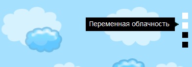
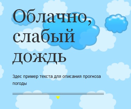
<!DOCTYPE html>

<html>

 <head>
 <title>Параллакс при прокрутке страницы</title>

<meta charset="utf-8" />
<link rel="stylesheet" media="all" href="css/main.css" />

<!-- Здесь прикрепляем скрипты -->
 <script src="http://ajax.googleapis.com/ajax/libs/jquery/1.6.1/jquery.min.js"></script>

 <script src="js/parallax.js"></script>
 </head>

<body>

<div id="wrapper">

 <header id="branding">
 <h1>Пример параллакса при прокрутке</h1>
 </header>

 <nav id="primary">
 <ul>
 <li>
 <h1>Облачно, слабый дождь</h1>
 <a class="manned-flight" href="#manned-flight">View</a>
 </li>
 <li>
 <h1>Переменная облачность</h1>
 <a class="frameless-parachute" href="#frameless-parachute">View</a>
 </li>
 <li>
 <h1>Грозовые дожди</h1>
 <a class="english-channel" href="#english-channel">View</a>
 </li>
 <li>
 <h1>Вот и все</h1>
 <a class="about" href="#about">View</a>
 </li>
 </ul>
 </nav>
 <!-- Текст на странице-->
 <div id="content">
 <article id="manned-flight">
 <header>
 <h1>Облачно, слабый дождь</h1>
 </header>
 <p>Здес пример текста для описания прогноза погоды</p>
 <nav class="next-prev">
 <hr />
 <a class="next frameless-parachute" href="#frameless-parachute">Next</a>
 </nav>
 </article>

 <article id="frameless-parachute">
 <header>
 <h1>Переменная облачность</h1>
 </header>
 <p>Здесь пишем второй пример для переменной облачности</p>
 <nav class="next-prev">
 <a class="prev manned-flight" href="#manned-flight">Prev</a>
 <hr />
 <a class="next english-channel" href="#english-channel">Next</a>
 </nav>
 </article>

 <article id="english-channel">
 <header>
 <h1>Грозовые дожди</h1>
 </header>
 <p>Третий пример для грозовых дождей</p>
 <nav class="next-prev">
 <a class="prev frameless-parachute" href="#frameless-parachute">Prev</a>
 <hr />
 <a class="next about" href="#about">Next</a>
 </nav>
 </article>

 <article id="about">
 <header>
 <h1>Вот и все</h1>
 </header>
 <p>Это пример параллакса при прокрутке</p>
 <nav class="next-prev">
 <a class="prev english-channel" href="#english-channel">Prev</a>
 <hr />
 </nav>
 </article>
 </div>

 <!-- Первый слой -->
 <div id="parallax-bg3">
 <img id="bg3-1" src="img/balloon.png" width="529" height="757" alt="Montgolfier hot air balloon"/>
 <img id="bg3-2" src="img/balloon2.png" width="529" height="757" alt="Frameless parachute"/>
 <img id="bg3-3" src="img/balloon3.png" width="446" height="713" alt="Blanchard's air balloon"/>
 <img id="bg3-4" src="img/ground.png" width="1104" height="684" alt="Landscape with trees and cows"/>
 </div>

 <!-- Второй слой -->
 <div id="parallax-bg2">
 <img id="bg2-1" src="img/cloud-lg1.png" alt="cloud"/>
 <img id="bg2-2" src="img/cloud-lg1.png" alt="cloud"/>
 <img id="bg2-3" src="img/cloud-lg1.png" alt="cloud"/>
 <img id="bg2-4" src="img/cloud-lg1.png" alt="cloud"/>
 <img id="bg2-5" src="img/cloud-lg1.png" alt="cloud"/>
 </div>

 <!-- Третий слой -->
 <div id="parallax-bg1">
 <img id="bg1-1" src="img/cloud-lg2.png" alt="cloud"/>
 <img id="bg1-2" src="img/cloud-lg2.png" alt="cloud"/>
 <img id="bg1-3" src="img/cloud-lg2.png" alt="cloud"/>
 <img id="bg1-4" src="img/cloud-lg2.png" alt="cloud"/>
 </div>

 </div>

 </body>

</html>
Как видите к всем объектам на этой странице уже присвоены классы, которые далее мы будем использовать в стилях. А так же у нас тут уже есть 3 слоя, которые имеют классы:
- parallax-bg3 — первый слой, самый верхний.
- parallax-bg2 — второй слой, средний.
- parallax-bg1 — и третий слой, самый нижний.
И к каждому из трёх слоёв уже присвоены готовые рисунки (объекты).
Ещё на странице у нас есть текст, у которого прокрутка стандартная. У него тоже позиция зафиксированная но прокручивается он вместе с бэкграундом. Хотя для текста можно тоже установить скорость прокрутки, но нужно создавать отдельный четвёртый слой.
Между тегами <head> и </head> не забудьте прикрепить стили, а также сам скрипт параллакса:
<link rel="stylesheet" media="all" href="css/main.css" />

<script src="js/parallax.js"></script>
Теперь самое интересное.
CSS
Для начала нужно убрать все отступы на краях страницы. Это делается следующим образом:
body {
 background: url(../img/strange_bullseyes.png) repeat 100% 0;
 overflow-x: hidden;
 height: 4550px;
 line-height: 1.5;
 color: #000;
 font-size: 14px;
 font-family: Arial,sans-serif;
}
Так же мы здесь задали бэграунд для страницы, он находится в исходниках, и задали точную высоту для страницы, она равна 4550px.
Теперь для поля #wrapper где будут находится все наши объекты нужно задать position: relative;. Таким образом мы показываем нашим рисункам где находится наше поле.
#wrapper {
 position: relative;
}
В данном пример мы будем использовать навигацию по так называемым разделам. Получается своеобразный большой слайдер. У пользователя есть два варианта, нажать на метку и он автоматически переместится к заданному месту, или же просто прокрутить страницу привычным нам способом. В обоих случаях выглядит очень красиво.
А вот сам код CSS навигации:
nav#primary {
 z-index: 5;
 position: fixed;
 top: 50%;
 right: 16px;
 margin-top: -40px;
}
nav#primary li {
 position: relative;
 height: 20px;
}
nav#primary a {
 display: block;
 width: 20px;
 height: 20px;
 text-indent: -9999px;
 background: transparent url('../img/nav-dot.png') 4px 4px no-repeat;
}
nav#primary a:hover, nav#primary a.active {
 background: transparent url('../img/nav-dot.png') 4px -16px no-repeat;
}
nav#primary h1 {
 position: absolute;
 right: 22px;
 top: -7px;
 display: none;
 padding: 4px 20px 4px 7px;;
 color: #fff;
 white-space: nowrap;
 background: transparent url('../img/nav-arrow.png') 100% 50% no-repeat;
 }
nav.next-prev {
 margin: 20px 0 0 0;
 }
 a.prev,
 a.next {
 display: block;
 width: 15px;
 height: 11px;
 text-indent: -9999px;
 }
 a.prev {
 margin: 0 auto 5px auto;
 background: transparent url('../img/scroll-arrow-up.png') 0 0 no-repeat;
 }
 a.prev:hover {
 background: transparent url('../img/scroll-arrow-up.png') 0 -11px no-repeat;
 }
 a.next {
 margin: 5px auto 0 auto;
 background: transparent url('../img/scroll-arrow-down.png') -1px 0 no-repeat;
 }
 a.next:hover {
 background: transparent url('../img/scroll-arrow-down.png') -1px -11px no-repeat;
 }
Ну а сейчас переходим к самим слоям
Слой текста и его позиции:
#content {
 z-index: 4;
 position: relative;
 max-width: 940px;
 padding: 0 10px;
 margin: 0 auto;
 line-height: 1.7;
 }
 #content article {
 width: 300px;
 }
 #manned-flight ,
 #frameless-parachute,
 #english-channel,
 #about {
 padding-top: 105px;
 }
 #manned-flight {
 position: absolute;
 top: 0px;
 }
 #frameless-parachute {
 position: absolute;
 top: 1090px;
 }
 #english-channel {
 position: absolute;
 top: 2180px;
 }
 #content h1 {
 margin: 0 0 25px 0;
 font-size: 60px;
 font-family: Georgia, serif;
 font-weight: normal;
 line-height: 65px;
 }
 #about {
 position: absolute;
 top: 3270px;
 }
Как видите, что для самого верхнего текста (#manned-flight) задана абсолютная позиция в 0 пикселей, а для второго текста (#frameless-parachute) позиция равна 1090px, что существенно ниже. Ещё один важный момент, для контента задан z-index: 4; самый верхний слой. Это делается для того, чтобы другие слои не закрывали текст.
Сейчас будем создавать слои из картинок:
Первый слой — самые большие облака (#parallax-bg3):
#parallax-bg3 {
 z-index: 3;
 position: fixed;
 left: 50%;
 top: 0;
 width: 940px;
 margin-left: -470px;
 }

 #bg3-1 {
 position: absolute;
 top: -111px;
 left: 355px;
 }
 #bg3-2 {
 position: absolute;
 top: 812px;
 left: 321px;
 }
 #bg3-3 {
 position: absolute;
 top: 1628px;
 left: 403px;
 }
 #bg3-4 {
 position: absolute;
 top: 2700px;
 left: -85px;
 }
Второй слой облаков:

#parallax-bg2 {
 z-index: 2;
 position: fixed;
 left: 50%;
 top: 0;
 width: 1200px;
 margin-left: -600px;
 }
 #bg2-1 {
 position: absolute;
 top: 162px;
 left: 200px;
 }
 #bg2-2 {
 position: absolute;
 top: 300px;
 left: 1150px;
 }
 #bg2-3 {
 position: absolute;
 top: 543px;
 left: -35px;
 }
 #bg2-4 {
 position: absolute;
 top: 1180px;
 left: 250px;
 }
 #bg2-5 {
 position: absolute;
 top: 900px;
 left: 890px;
 }
И третий самый последний слой:

#parallax-bg1 {
 z-index: 1;
 position: fixed;
 left: 50%;
 top: 0;
 width: 1200px;
 margin-left: -600px;
 }
 #bg1-1 {
 position: absolute;
 top: 85px;
 left: -270px;
 }
 #bg1-2 {
 position: absolute;
 top: 440px;
 left: 795px;
 }
 #bg1-3 {
 position: absolute;
 top: 900px;
 left: -220px;
 }
 #bg1-4 {
 position: absolute;
 top: 1020px;
 left: 450px;
 }
Теперь давайте посмотри как будет выглядеть наш целый файл CSS с исходников:
html, body, div, span, applet, object, iframe,
h1, h2, h3, h4, h5, h6, p, blockquote, pre,
a, abbr, acronym, address, big, cite, code,
del, dfn, em, img, ins, kbd, q, s, samp,
small, strike, strong, sub, sup, tt, var,
b, u, i, center,
dl, dt, dd, ol, ul, li,
fieldset, form, label, legend,
table, caption, tbody, tfoot, thead, tr, th, td,
article, aside, canvas, details, embed,
figure, figcaption, footer, header, hgroup,
menu, nav, output, ruby, section, summary,
time, mark, audio, video {
 margin: 0;
 padding: 0;
 border: 0;
 font-size: 100%;
 font: inherit;
 vertical-align: baseline;

}

body {

line-height: 1;
}
ol, ul {
 list-style: none;
}
blockquote, q {
 quotes: none;
}
blockquote:before, blockquote:after,
q:before, q:after {
 content: '';
 content: none;
}
table {
 border-collapse: collapse;
 border-spacing: 0;
}

/* Общее
*****************************************************************/

html {
 overflow-y: scroll;
 }
body {
 background: url(../img/strange_bullseyes.png) repeat 100% 0;
 overflow-x: hidden;
 height: 4550px;
 line-height: 1.5;
 color: #000;
 font-size: 14px;
 font-family: Arial,sans-serif;
}
h1 {
 color: #333;
}
a, a:link,
a:active,
a:visited {
 -webkit-transition: color 0.25s ease-out;
 -moz-transition: color 0.25s ease-out;
 -o-transition: color 0.25s ease-out;
 transition: color 0.25s ease-out;
 color:#21a97e;
 outline: none;
 text-decoration:none;
 }
 a:hover {
 color:#000;
 }
img {
 display:block;
 }
p {
 margin:1em 0;
 }

/* Линии
*****************************************************************/

hr {
 margin: 0;
 border: none;
 border-top: 1px solid #3b3b3b;
 border-bottom: 1px solid #3b3b3b;
 height: 3px;
}

/* Структура страницы
*****************************************************************/

#wrapper {
 position: relative;
}
#branding {
 width: 100%;
 background: #fff;
 }
 #branding h1 {
 width: 940px;
 padding: 10px 15px;
 margin: 0 auto;
 text-transform: uppercase;
 font-size: 18px;
 font-weight: bold;
 }

/* Навигация
*****************************************************************/

nav#primary {
 z-index: 5;
 position: fixed;
 top: 50%;
 right: 16px;
 margin-top: -40px;
}
nav#primary li {
 position: relative;
 height: 20px;
}
nav#primary a {
 display: block;
 width: 20px;
 height: 20px;
 text-indent: -9999px;
 background: transparent url('../img/nav-dot.png') 4px 4px no-repeat;
}
nav#primary a:hover, nav#primary a.active {
 background: transparent url('../img/nav-dot.png') 4px -16px no-repeat;
}
nav#primary h1 {
 position: absolute;
 right: 22px;
 top: -7px;
 display: none;
 padding: 4px 20px 4px 7px;;
 color: #fff;
 white-space: nowrap;
 background: transparent url('../img/nav-arrow.png') 100% 50% no-repeat;
 }
nav.next-prev {
 margin: 20px 0 0 0;
 }
 a.prev,
 a.next {
 display: block;
 width: 15px;
 height: 11px;
 text-indent: -9999px;
 }
 a.prev {
 margin: 0 auto 5px auto;
 background: transparent url('../img/scroll-arrow-up.png') 0 0 no-repeat;
 }
 a.prev:hover {
 background: transparent url('../img/scroll-arrow-up.png') 0 -11px no-repeat;
 }
 a.next {
 margin: 5px auto 0 auto;
 background: transparent url('../img/scroll-arrow-down.png') -1px 0 no-repeat;
 }
 a.next:hover {
 background: transparent url('../img/scroll-arrow-down.png') -1px -11px no-repeat;
 }

/* Параллакс
*****************************************************************/

/* content */
#content {
 z-index: 4;
 position: relative;
 max-width: 940px;
 padding: 0 10px;
 margin: 0 auto;
 line-height: 1.7;
 }
 #content article {
 width: 300px;
 }
 #manned-flight ,
 #frameless-parachute,
 #english-channel,
 #about {
 padding-top: 105px;
 }
 #manned-flight {
 position: absolute;
 top: 0px;
 }
 #frameless-parachute {
 position: absolute;
 top: 1090px;
 }
 #english-channel {
 position: absolute;
 top: 2180px;
 }
 #content h1 {
 margin: 0 0 25px 0;
 font-size: 60px;
 font-family: Georgia, serif;
 font-weight: normal;
 line-height: 65px;
 }
 #about {
 position: absolute;
 top: 3270px;
 }
/* foreground (Первые, большие облака) */
#parallax-bg3 {
 z-index: 3;
 position: fixed;
 left: 50%;
 top: 0;
 width: 940px;
 margin-left: -470px;
 }

 #bg3-1 {
 position: absolute;
 top: -111px;
 left: 355px;
 }
 #bg3-2 {
 position: absolute;
 top: 812px;
 left: 321px;
 }
 #bg3-3 {
 position: absolute;
 top: 1628px;
 left: 403px;
 }
 #bg3-4 {
 position: absolute;
 top: 2700px;
 left: -85px;
 }
/* midground (Облака) */
#parallax-bg2 {
 z-index: 2;
 position: fixed;
 left: 50%;
 top: 0;
 width: 1200px;
 margin-left: -600px;
 }
 #bg2-1 {
 position: absolute;
 top: 162px;
 left: 200px;
 }
 #bg2-2 {
 position: absolute;
 top: 300px;
 left: 1150px;
 }
 #bg2-3 {
 position: absolute;
 top: 543px;
 left: -35px;
 }
 #bg2-4 {
 position: absolute;
 top: 1180px;
 left: 250px;
 }
 #bg2-5 {
 position: absolute;
 top: 900px;
 left: 890px;
 }
/* background (Облака) */
#parallax-bg1 {
 z-index: 1;
 position: fixed;
 left: 50%;
 top: 0;
 width: 1200px;
 margin-left: -600px;
 }
 #bg1-1 {
 position: absolute;
 top: 85px;
 left: -270px;
 }
 #bg1-2 {
 position: absolute;
 top: 440px;
 left: 795px;
 }
 #bg1-3 {
 position: absolute;
 top: 900px;
 left: -220px;
 }
 #bg1-4 {
 position: absolute;
 top: 1020px;
 left: 450px;
 }
JQuery
А сейчас мы будем для каждого слоя слоя ставить скорость прокрутки, это делается следующим образом:
/* Скорость прокрутки слоёв */
function parallaxScroll(){
 var scrolled = $(window).scrollTop();
 $('#parallax-bg1').css('top',(0-(scrolled*.25))+'px');
 $('#parallax-bg2').css('top',(0-(scrolled*.5))+'px');
 $('#parallax-bg3').css('top',(0-(scrolled*.75))+'px');
}
Как видите, что для самого верхнего слоя parallax-bg3 самая высокая скорость прокрутки, Для второго слоя самая низкая , и для последнего слоя средняя скорость.
Теперь вот как выглядит скрипт для самой навигации:
$('a.manned-flight').click(function(){
 $('html, body').animate({
 scrollTop:0
 }, 1000, function() {
 parallaxScroll();
 });
 return false;
 });
 $('a.frameless-parachute').click(function(){
 $('html, body').animate({
 scrollTop:$('#frameless-parachute').offset().top
 }, 1000, function() {
 parallaxScroll();
 });
 return false;
 });
 $('a.english-channel').click(function(){
 $('html, body').animate({
 scrollTop:$('#english-channel').offset().top
 }, 1000, function() {
 parallaxScroll();
 });
 return false;
 });
 $('a.about').click(function(){
 $('html, body').animate({
 scrollTop:$('#about').offset().top
 }, 1000, function() {
 parallaxScroll();
 });
 return false;
 });
Пример ι Скачать исходники
Вот в принципе и всё, друзья. Если у Вас возникну какие либо вопросы, спрашивайте в комментариях. До скорых встреч.
